OVERVIEW
Time
May - July 2023
Duration
3 months
Project Brief
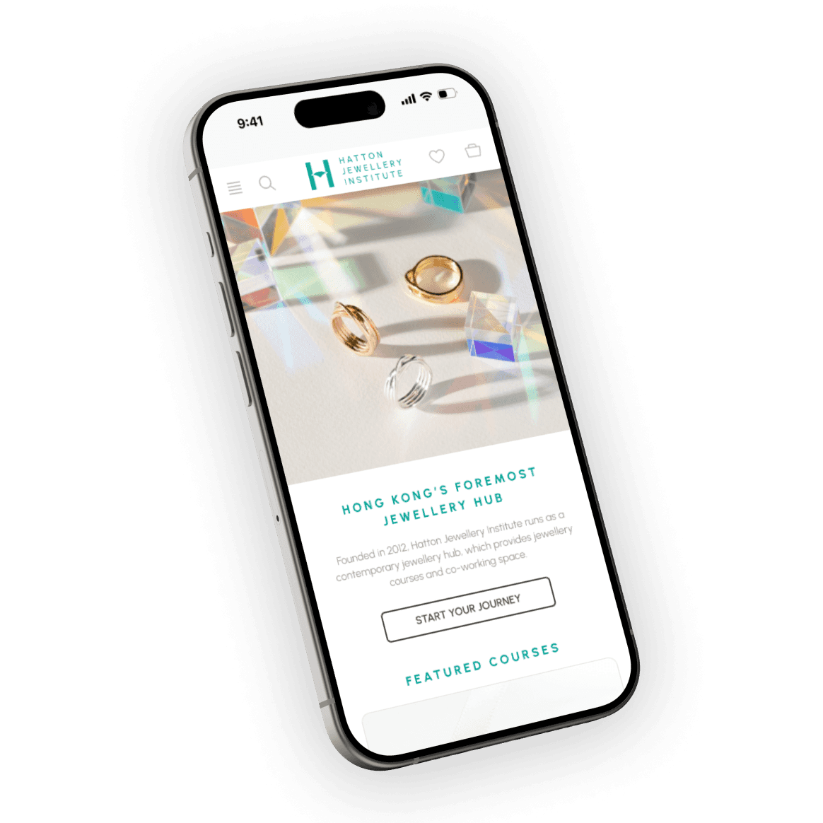
The inspiration for this project came from my personal experience of learning jewellery making at Hatton Jewellery Institute. Booking courses and scheduling classes solely through email proved to be a time-consuming and tedious process, prompting me to seek ways to streamline it and minimize the possibility of errors. The goal of this project is to enhance the course booking and class scheduling experience for Hatton's website. This will be achieved through the implementation of a digital booking system that provides efficient booking and scheduling services.
Role
UI/UX Designer
—
Competitive Analysis
User Journey Mapping
Prototyping
Usability Testing
Brand Identity Renewal
FINAL OUTCOME
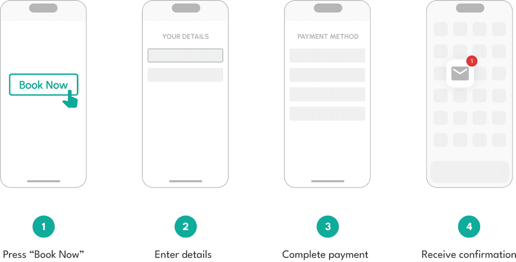
Course Booking Time (Estimated)
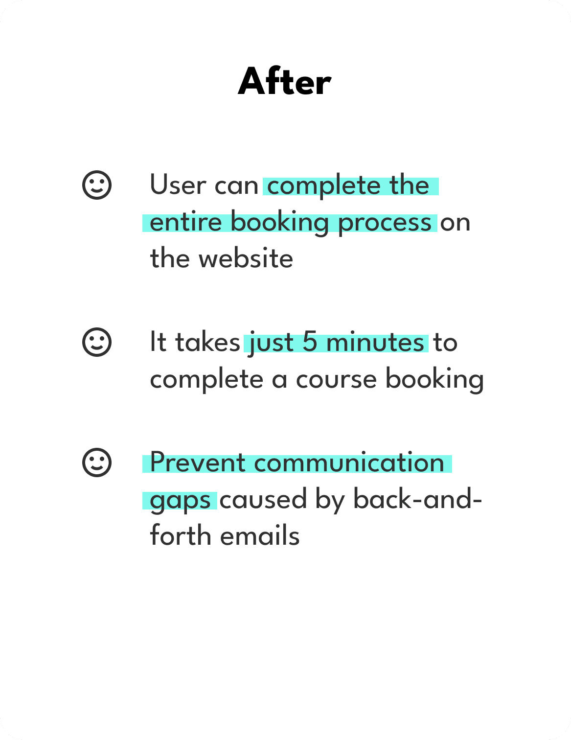
The updated layout offers improved organization and simplified navigation. Additionally, users can now opt for online payments instead of sending a physical cheque.


Press “Book Now”
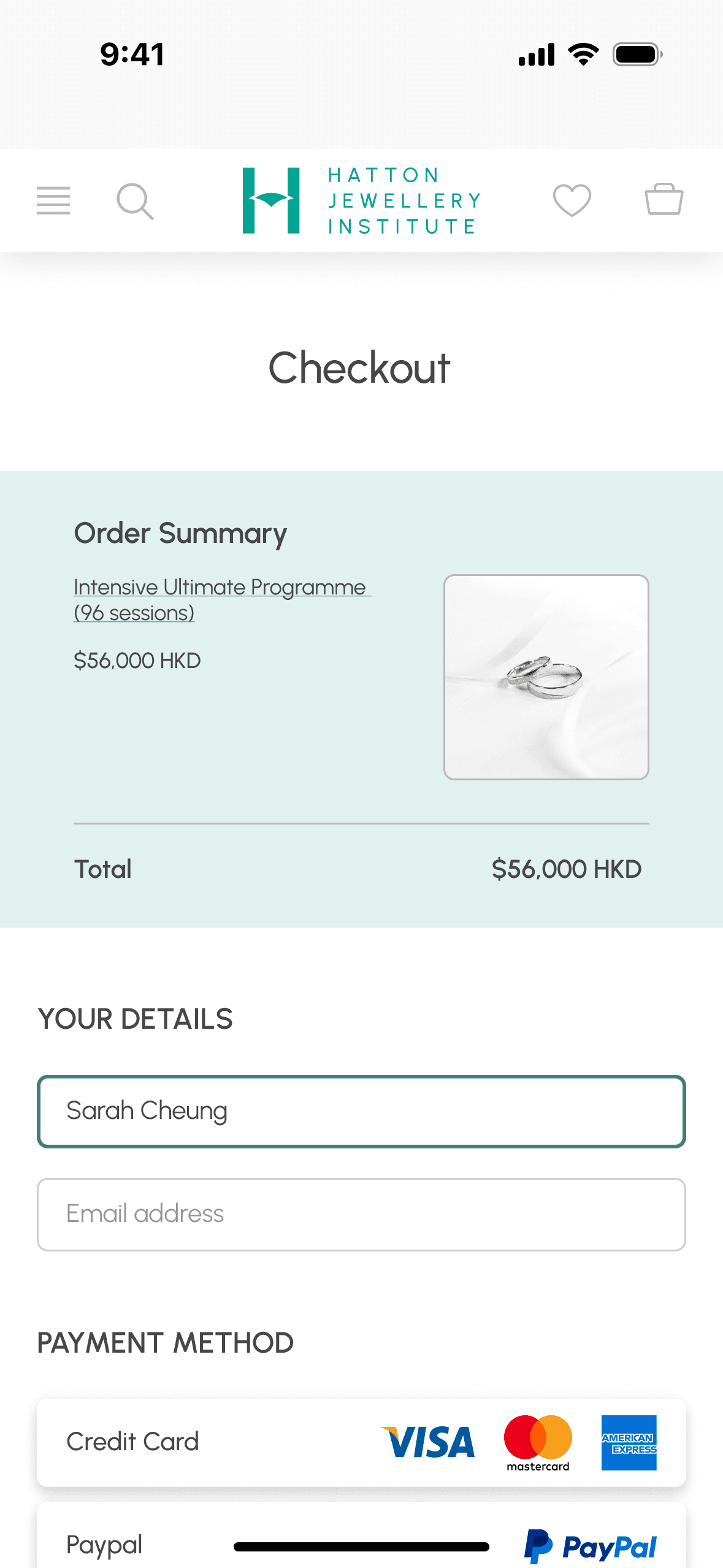

Fill in basic info
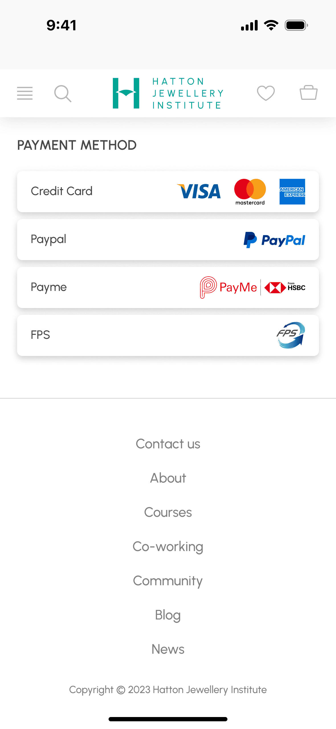

Complete payment
Users can now easily manage classes on the online booking platform, eliminating the need for back-and-forth emails that take days to confirm.
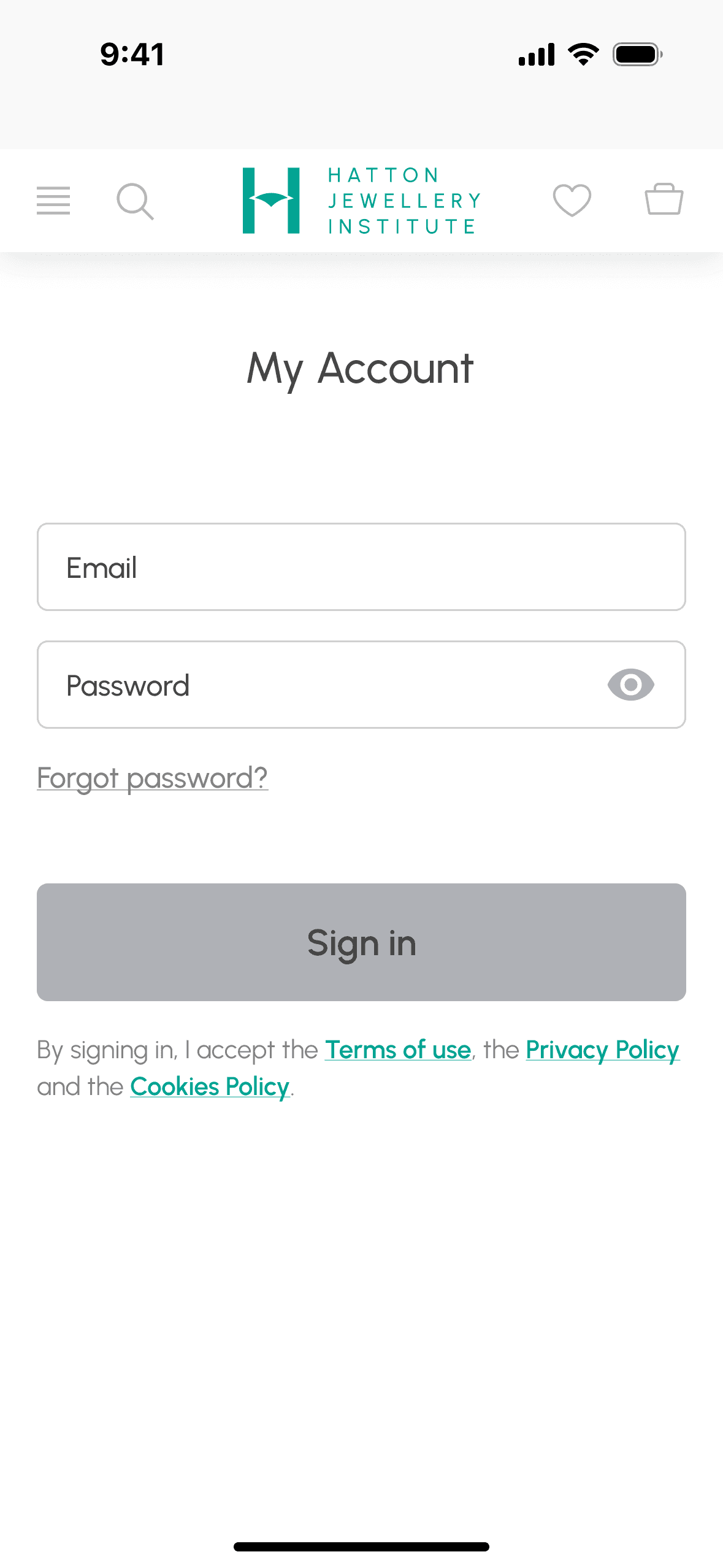

Sign in
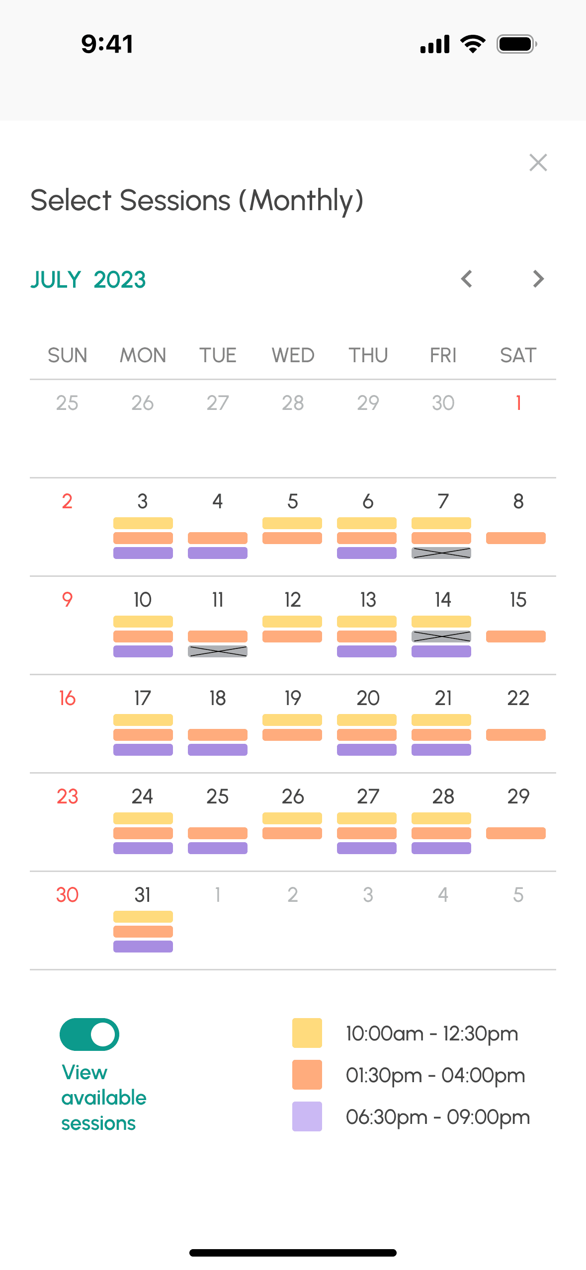

Schedule sessions
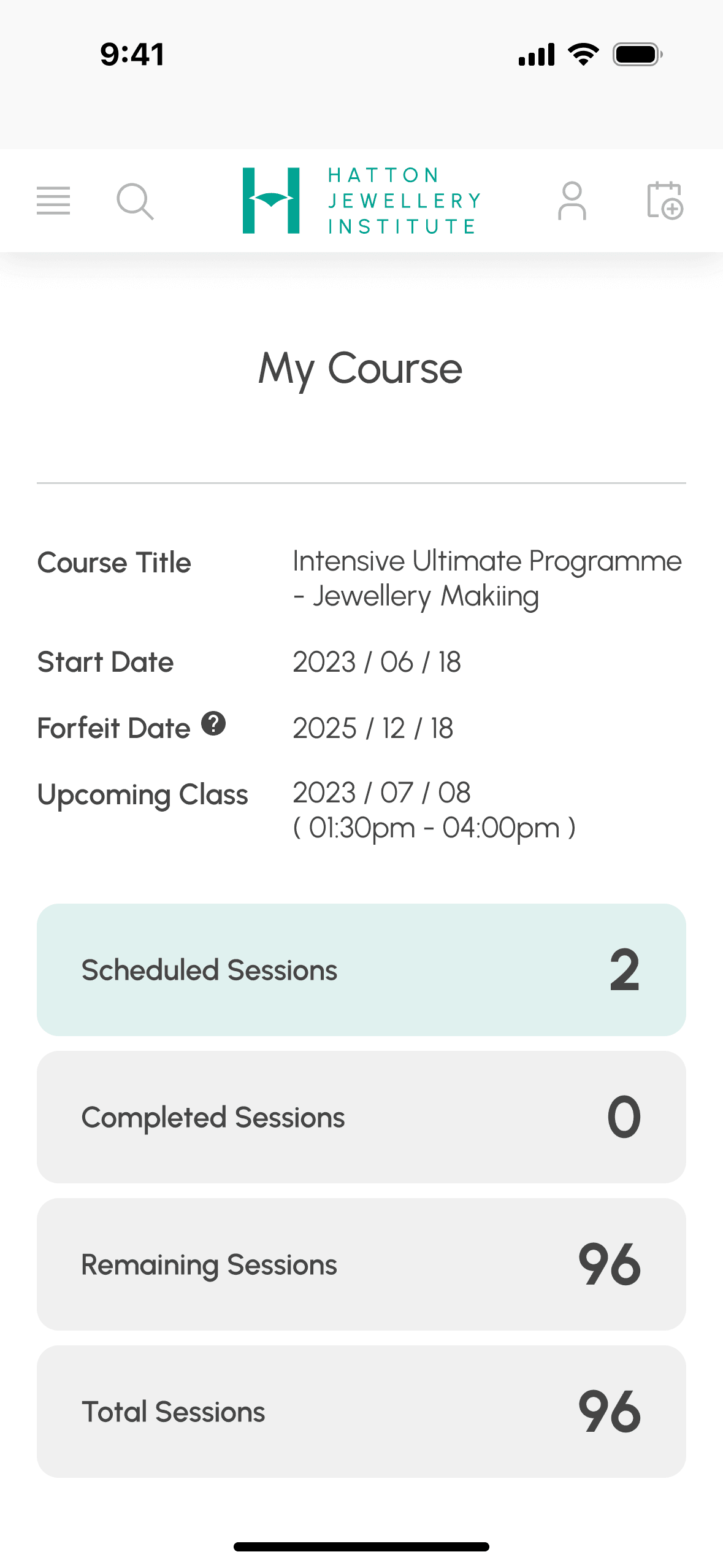

Manage classes
MAIN CHALLENGES
UNDERSTAND THE PROBLEM
User Journey Map
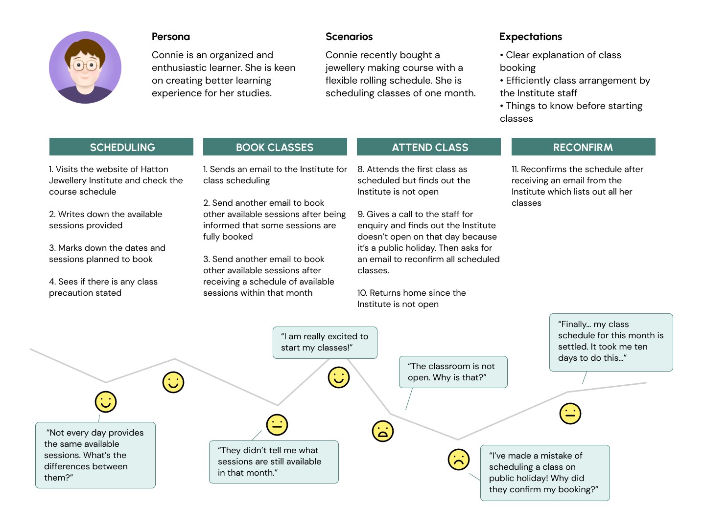
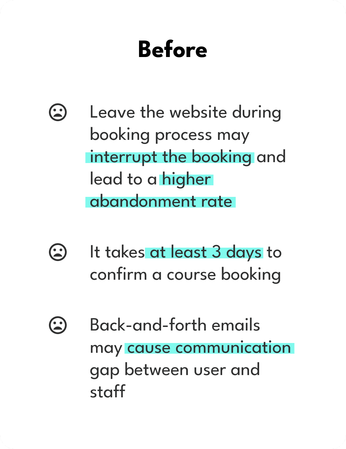
The user journey map uncovered pain points that an existing user encountered while attempting to book a course via email. The journey began from the moment the user landed on the Hatton Jewellery Institute website and continued until she confirmed her scheduled classes.
01
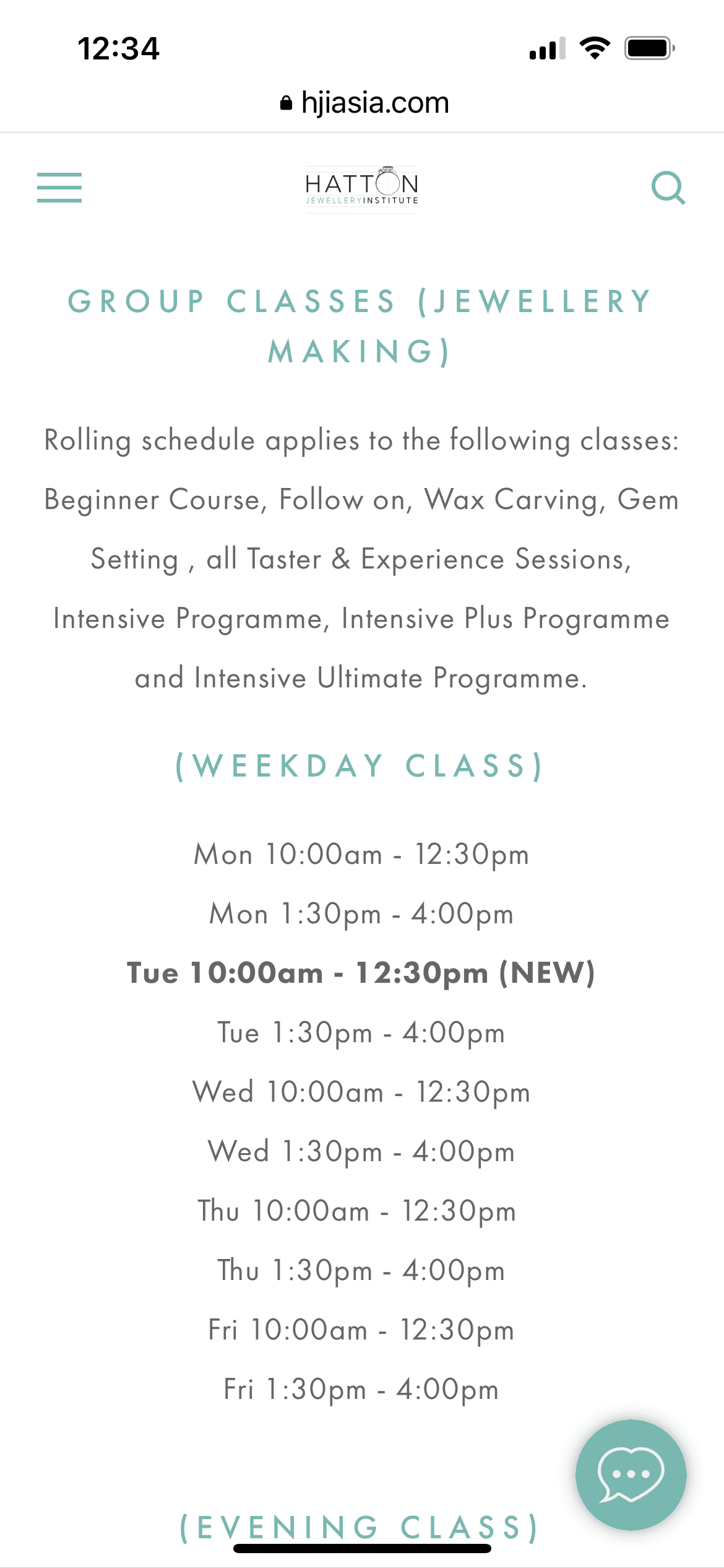
User finds the format of course schedule non-intuitive.
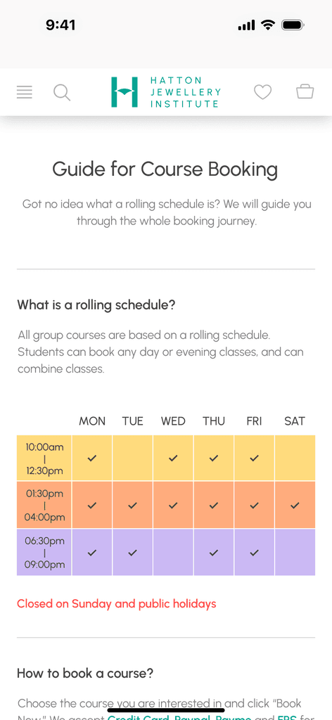
At first glance, timeslots are presented in list format, making it difficult for the user to comprehend the overall schedule.
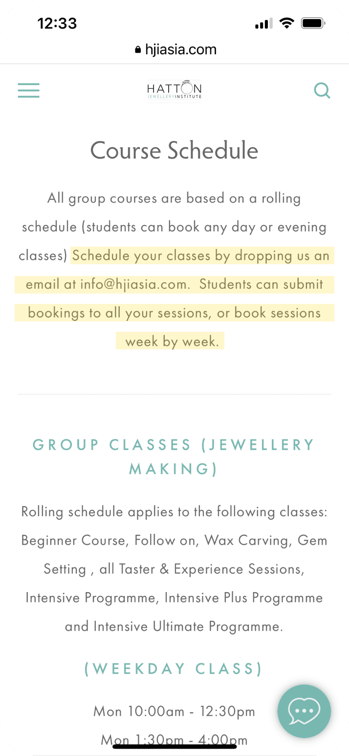
02
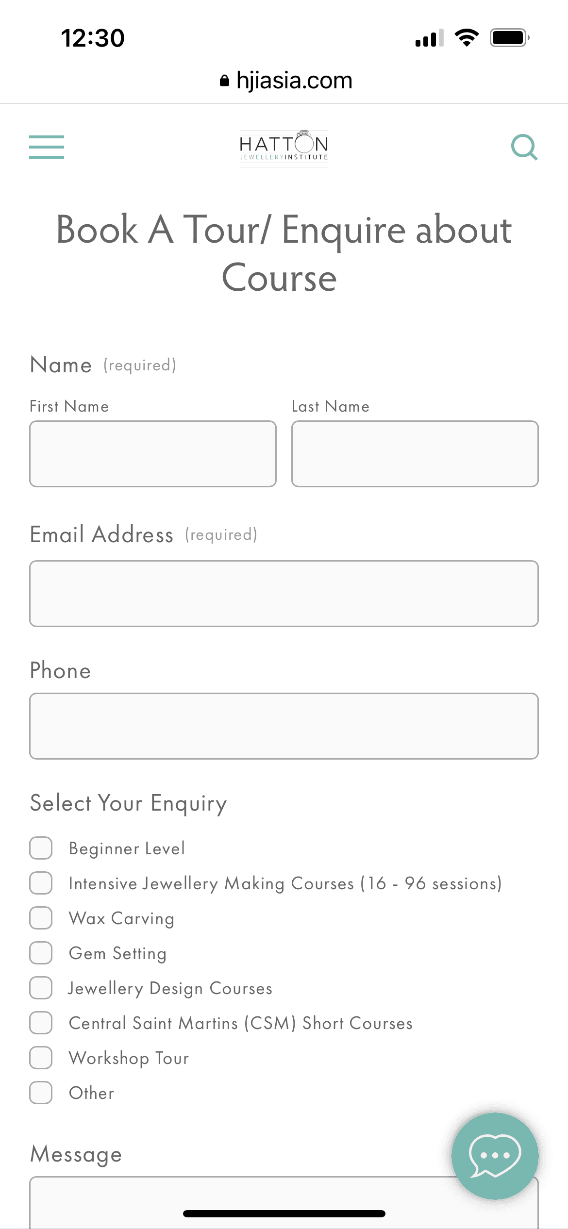
User finds the course booking method inconvenient.
User can book a course by leaving a message on website or directly contacting the staff through email. A reply should be expected within 2 to 3 business days.
03
User attended a class confirmed but found that the Institute is closed.
User sent a class scheduling plan to the staff and received confirmation, including a class on a public holiday, which isn’t the business day of the Institute.
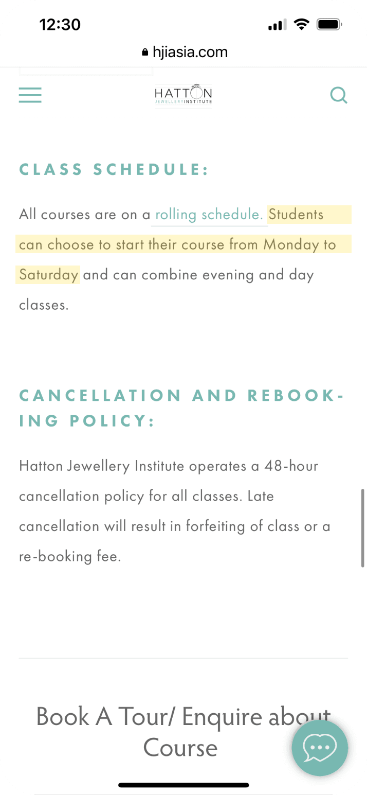
04
User finds the class scheduling process inefficient.
Class scheduling is completed through back-and-forth emails, causing confusion among user and staff, and also wasting a lot of time for both sides on confirming the available sessions.
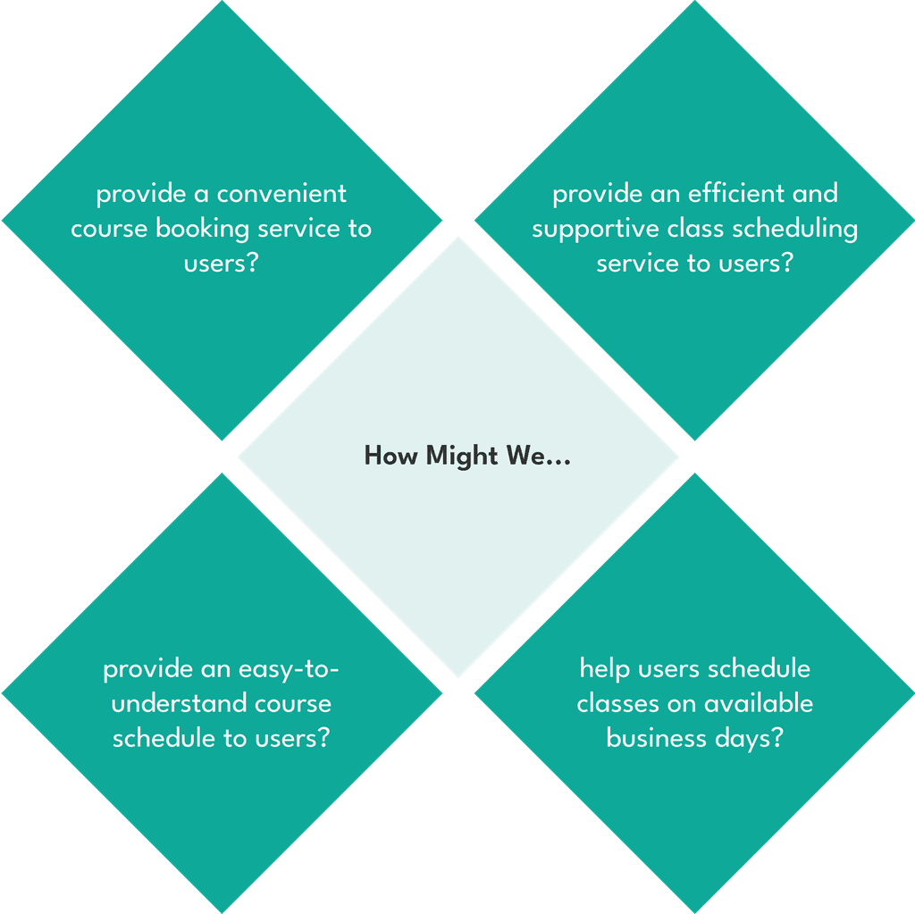
OPPORTUNITIES & JOURNEY MAPPING
New Journey Mapping
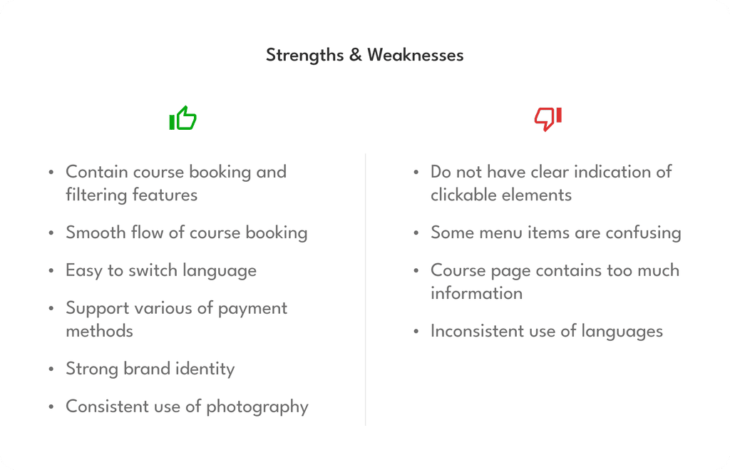
KNOW THE COMPETITORS

TEST IDEAS WITH WIREFRAMES & PROTOTYPES

Home page
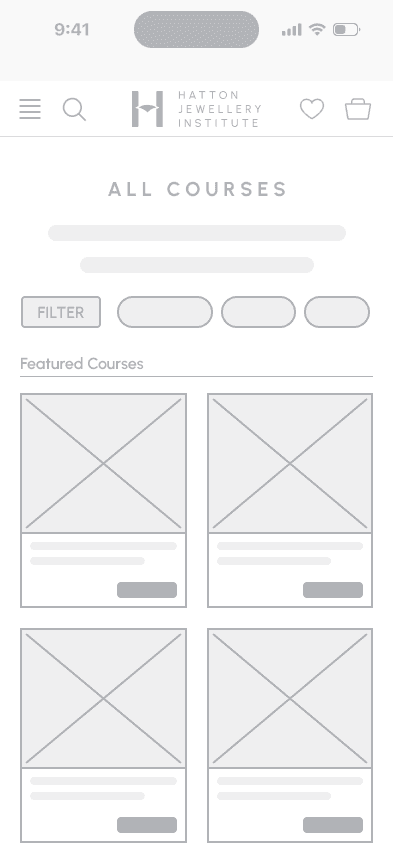
All Courses page
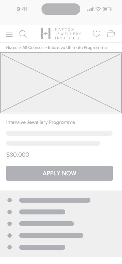
Course page
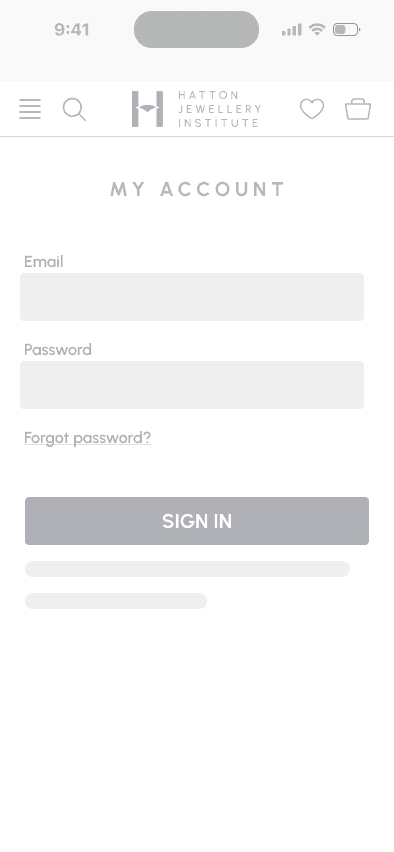
My Account page
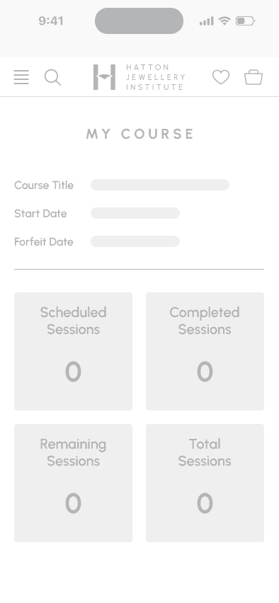
My Course page

Project Goals
• Users can complete the course booking and class scheduling processes easily and efficiently.
• User can understand the course contents by a quick skim.
• Users will form favorable and professional opinions about the brand.
Features

Course filtering feature

Course Booking feature

Checkout feature

Sign in feature

Class scheduling feature
Usability Testing
Determine if the user flow of class scheduling is difficult to follow.
Determine if the user flow of course booking is difficult to follow.
Round 1
Type
Moderated Usability Testing
Participants
4 participants, 3 females, 1 male, aged 24 to 33;
All participants have joined craft courses before
01
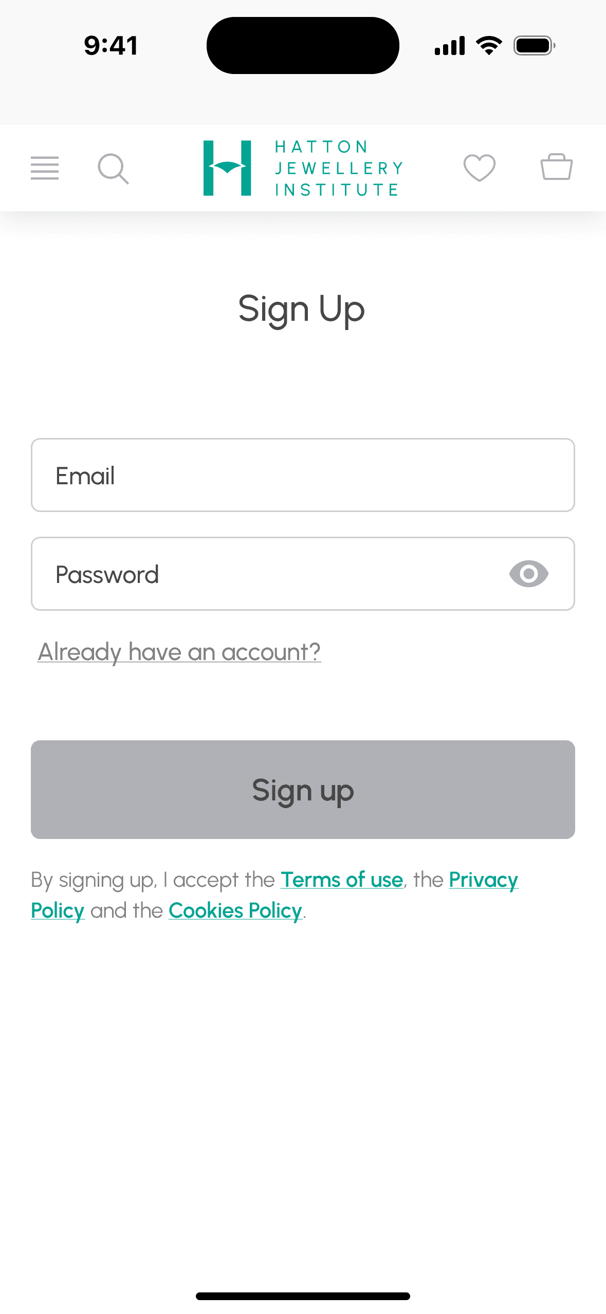
“Sign Up” before book course becomes a barrier
Users were annoyed by the Sign Up message after they pressed the “Book Now” button to book a course, since they would like to take a glimpse of what the booking process looks like before they took any action.
02
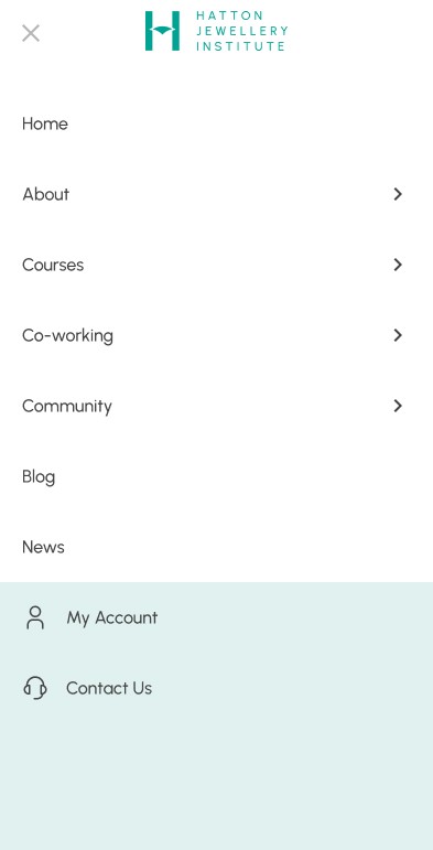
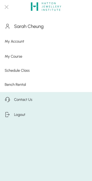
Change of menu after signed in causes bewilderment
Users felt bewildered after they entered the member panel and found the main menu had turned into a member menu and they couldn't find the items on the original menu.
03
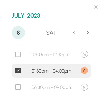
Auto-save of selected sessions leads to confusion
Users were confused by the auto-save setting of selected sessions and unsure if their selections were saved since no "Save" button was provided.
Improved items based on 1st round testing

Let users book a course without signing up, and send sign-in details of the class scheduling platform to users after the purchase has been completed.

Let main menu remains in their original location, and place the member menu in another location, so that both menus can be easily accessed by users.

Remove the auto-save setting of the session selection, and use "Save" and "Add to selection" buttons to lead users to the next step.
Round 2
Type
Moderated Usability Testing
Participants
3 participants, 3 female, aged 30-34;
All participants have joined craft courses before
01
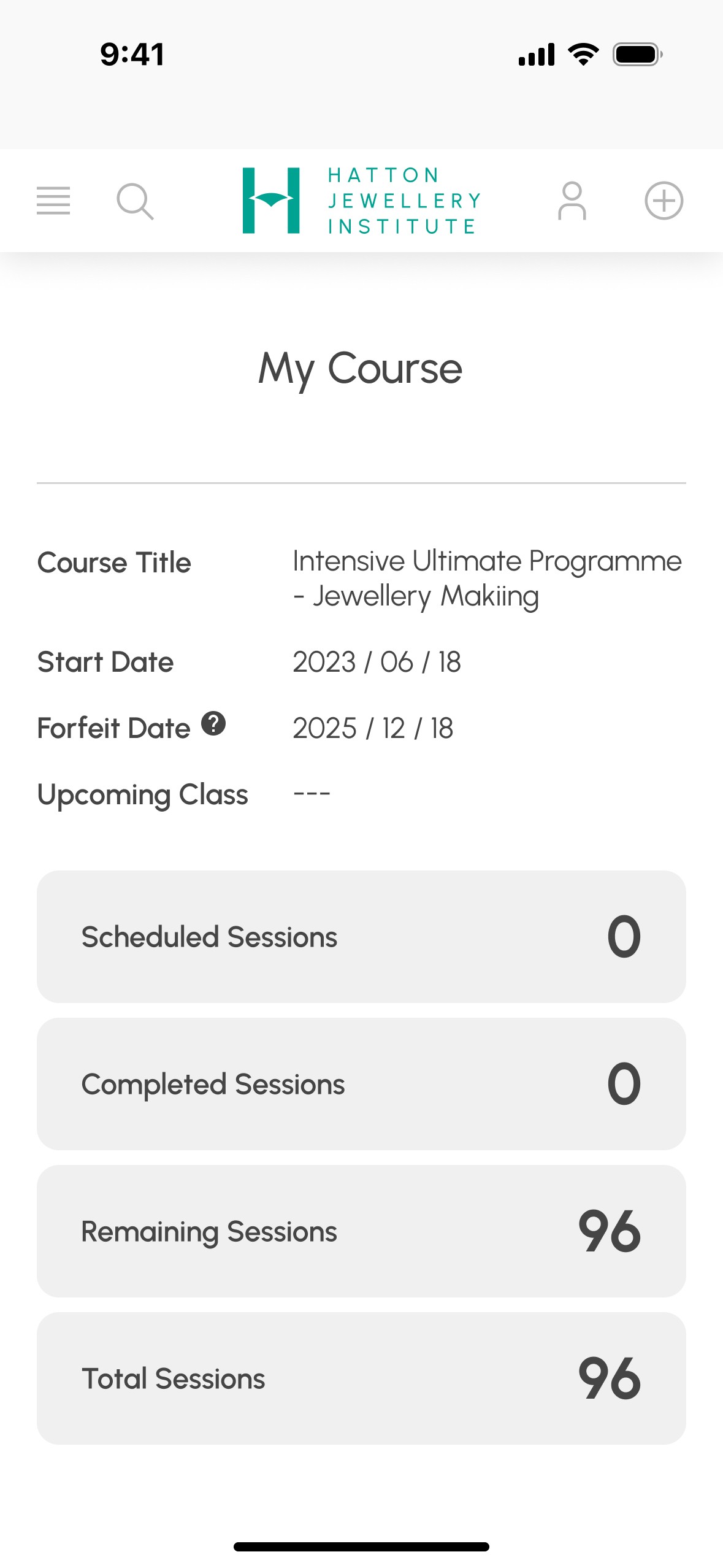
Inadequate guidance for class scheduling
Users were not aware of the fast access button for scheduling classes. It takes some time for them to figure out its meaning.
02
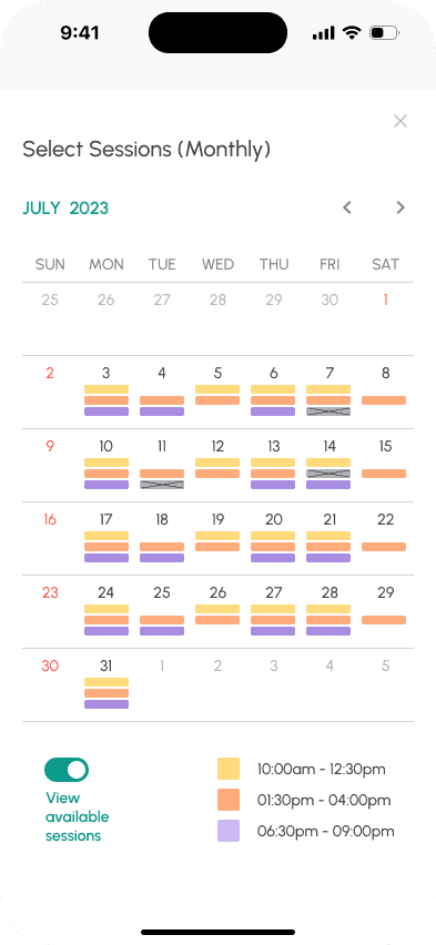
"View available sessions" feature is inconvenient
Users were bothered that they had to switch on a toggle to view available sessions on the "Select Sessions (Monthly)" page.
03
Need for class policy disclaimer as friendly reminder
Users were expecting a reminder of the class policy that all rearrangements must be made at least 48 hours before the class.


Course Booking
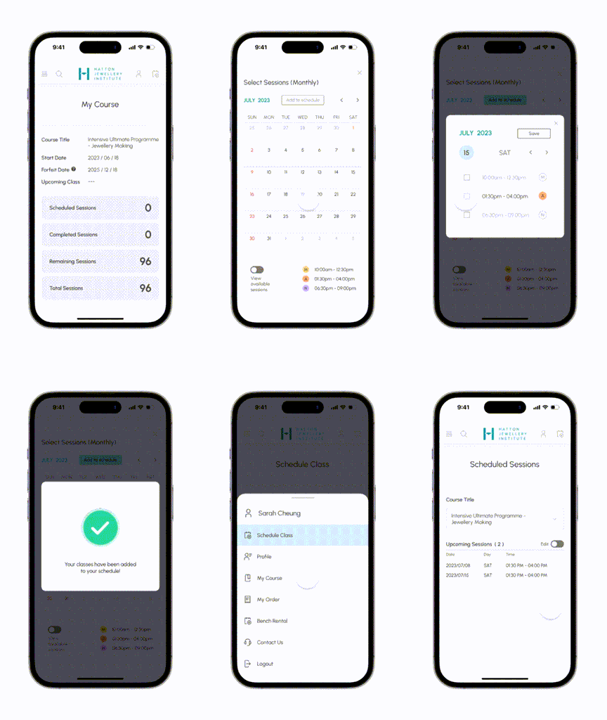
Class Scheduling (Monthly)

Class Scheduling (Custom)


BRAND IDENTITY RENEWAL
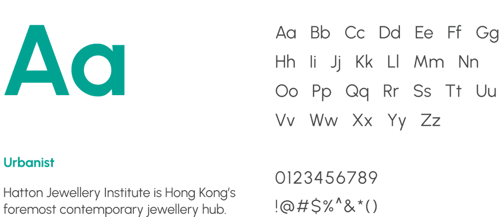
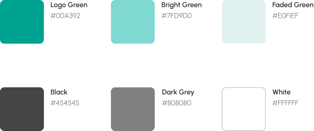
Targeting working women who enjoy hobby spending, the new design aims to create a style with elegant, energetic, and bright vibes.
BEFORE & AFTER
Home Page
Before

After

All Courses
Before

After

Course Page
Before
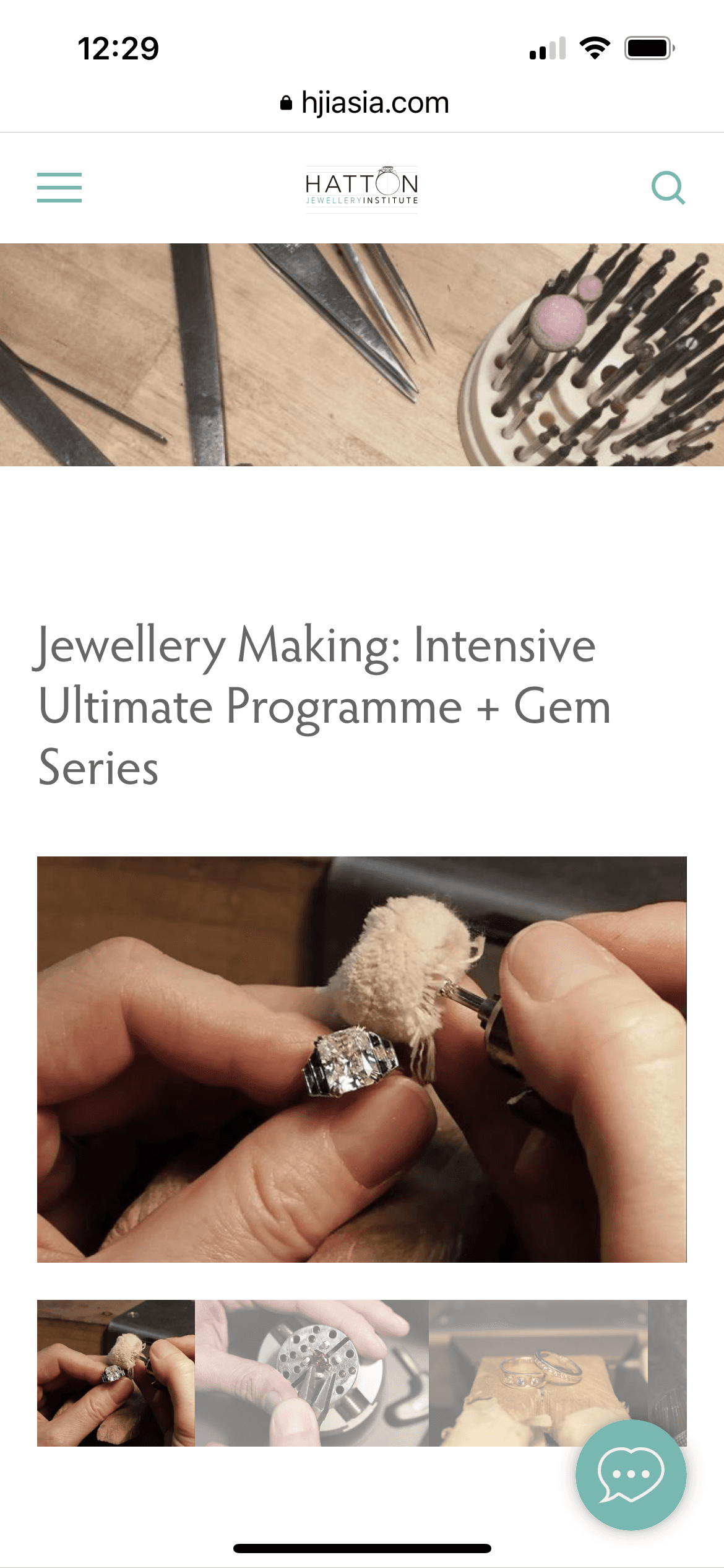
After

Course Schedule
Before

After
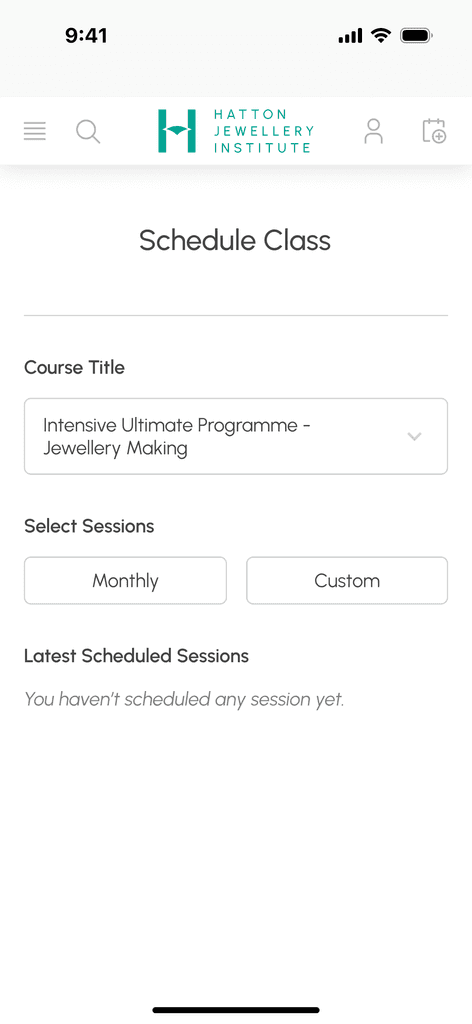
Schedule Class
Before
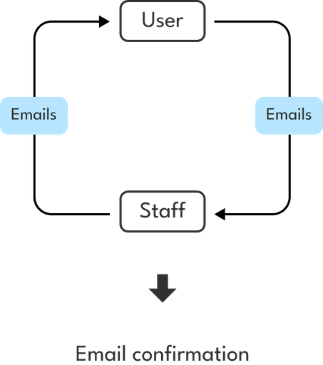
After
TAKEAWAYS
This project has helped me level up my skills in using a customer journey map to identify pain points in the purchasing and service use process. It’s crucial to conduct user research before starting a project to define the actual problem, get ideas flowing, and develop solutions accordingly. The courses provided by Hatton are super cool, and it is exciting to create a booking system while learning from them. I look forward to seeing an upgraded version of their website in the future.
My handmade work learnt at Hatton, a silver curb link bracelet.
