OVERVIEW
OVERVIEW
Time
Time
Nov 2024
Nov 2024
Duration
Duration
2 weeks
2 weeks
Project Brief
Project Brief
The inspiration for this project stemmed from my experience searching for new Switch games. I came across an advertisement for Nintendo Switch Online (NSO), which is a game subscription service of Nintendo, and decided to explore its plans. I found it challenging to understand the service content and compare the benefits of different plan options. Consequently, I aimed to identify the problems within the onboarding process and provide solutions to streamline it, ultimately creating a more enjoyable experience for users.
The inspiration for this project stemmed from my experience searching for new Switch games. I came across an advertisement for Nintendo Switch Online (NSO), which is a game subscription service of Nintendo, and decided to explore its plans. I found it challenging to understand the service content and compare the benefits of different plan options. Consequently, I aimed to identify the problems within the onboarding process and provide solutions to streamline it, ultimately creating a more enjoyable experience for users.
Role
Role
UX/UI Designer
—
User Research
Competitive Analysis
User Journey Mapping
Wireframing
UX/UI Designer
—
User Research
Competitive Analysis
User Journey Mapping
Wireframing


FINAL OUTCOME
FINAL OUTCOME
More Efficient, Less Ambiguous
More Efficient, Less Ambiguous
More Efficient, Less Ambiguous
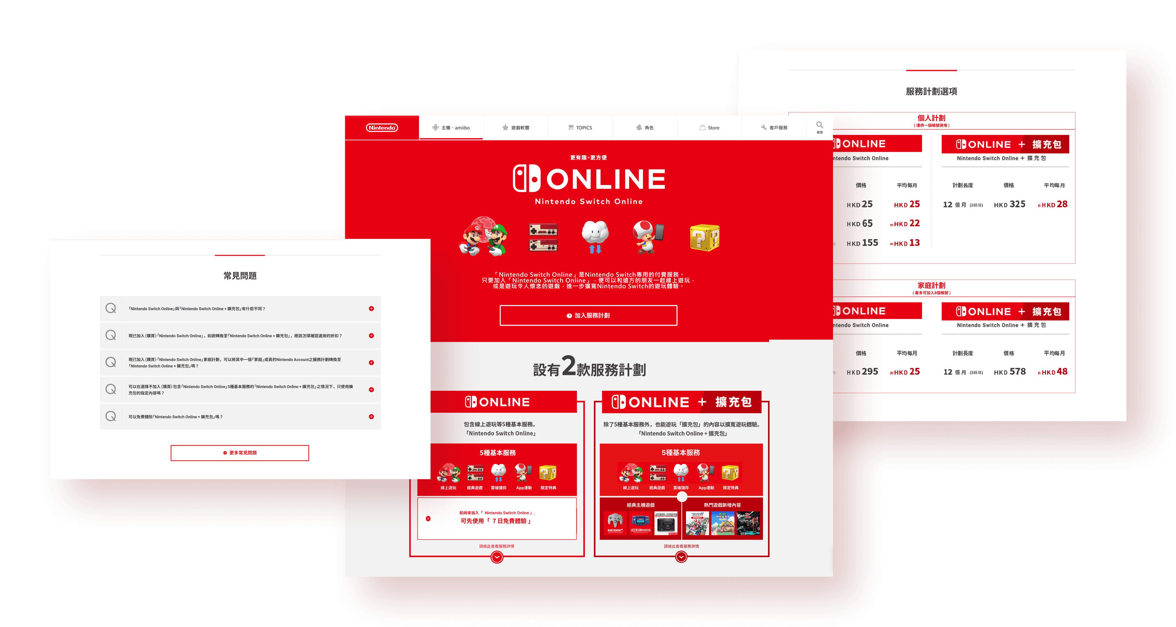
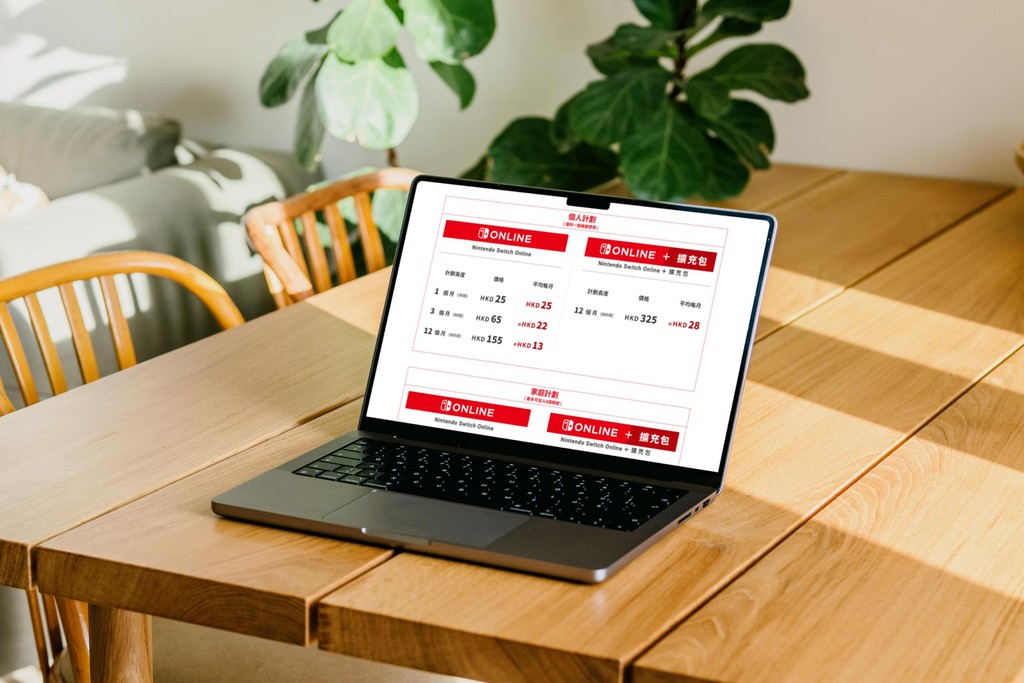
After optimization, the onboarding process for Nintendo Switch Online (NSO) has been streamlined. Complex information about the game service plans has been integrated, and the clarity of the text has been enhanced. As a result, the content is more straightforward and easier to understand, making the onboarding process more accessible and efficient.
After optimization, the onboarding process for Nintendo Switch Online (NSO) has been streamlined. Complex information about the game service plans has been integrated, and the clarity of the text has been enhanced. As a result, the content is more straightforward and easier to understand, making the onboarding process more accessible and efficient.


DESIGN AUDIT
DESIGN AUDIT
Friction in Accessing Information
Friction in Accessing Information
Friction in Accessing Information
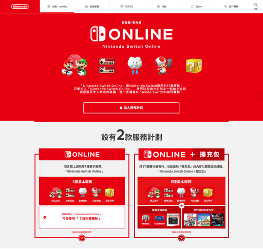
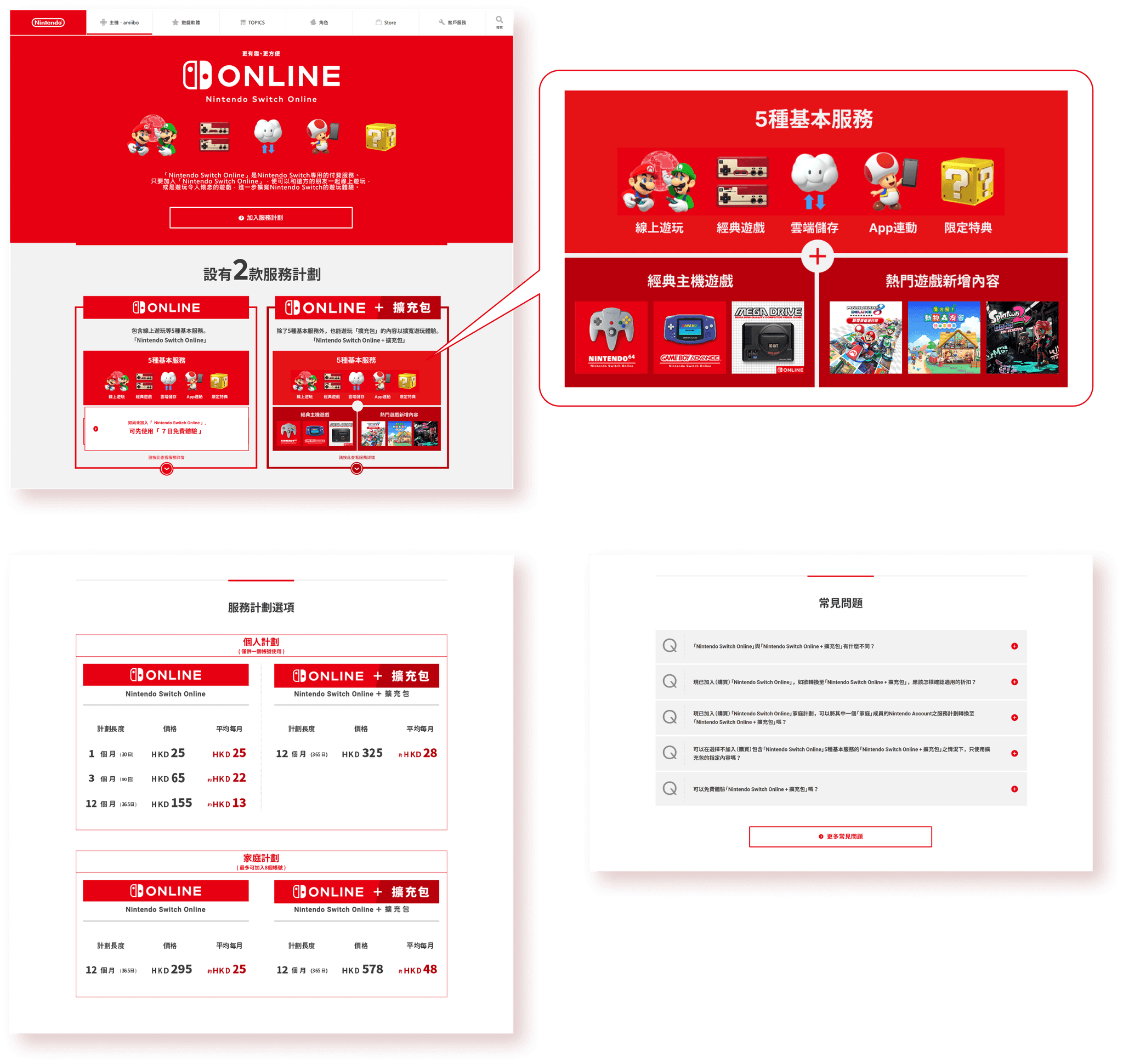
If users begin their journey from the Nintendo homepage, they may first encounter a pre-homepage before entering the Nintendo Switch Online (NSO) homepage that introduces the details of the service plans, serving as an entrance. To access pricing information, users must click one of the Call to Action buttons on NSO homepage. The information users need to consider when deciding whether to make a purchase is scattered across different pages, making the process of comparison and decision-making much more difficult.
If users begin their journey from the Nintendo homepage, they may first encounter a pre-homepage before entering the Nintendo Switch Online (NSO) homepage that introduces the details of the service plans, serving as an entrance. To access pricing information, users must click one of the Call to Action buttons on NSO homepage. The information users need to consider when deciding whether to make a purchase is scattered across different pages, making the process of comparison and decision-making much more difficult.


Bad Navigation and
Complex Service Content
Bad Navigation and
Complex Service Content
Bad Navigation and
Complex Service Content
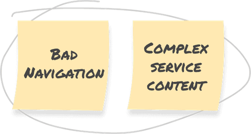
My navigation began on the Nintendo homepage, where I searched for Nintendo Switch Online (NSO), but I found no direct access link in the menu bar. Then, I spent some time navigating to locate the NSO homepage.
My navigation began on the Nintendo homepage, where I searched for Nintendo Switch Online (NSO), but I found no direct access link in the menu bar. Then, I spent some time navigating to locate the NSO homepage.
The service plan contains a wealth of information, including the game library, exclusive titles, usage details, and pricing, which can be overwhelming for users trying to understand the service, especially those encountering game subscriptions for the first time. Additionally, this information is scattered across different pages, making it difficult for users to form a comprehensive understanding of the service plan.
The service plan contains a wealth of information, including the game library, exclusive titles, usage details, and pricing, which can be overwhelming for users trying to understand the service, especially those encountering game subscriptions for the first time. Additionally, this information is scattered across different pages, making it difficult for users to form a comprehensive understanding of the service plan.
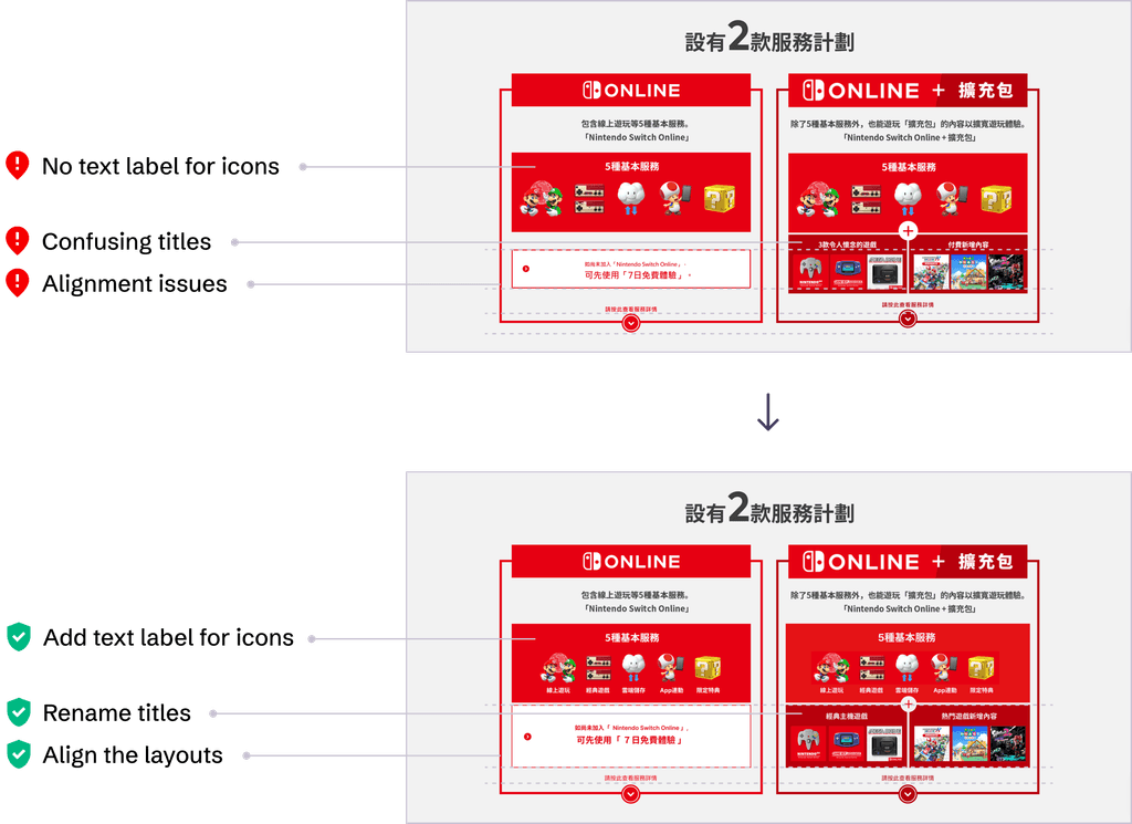
Given the complexity of the content, it is essential to present it in a clear and accessible manner. However, some design elements fall short of this goal; for instance, the lack of text labels for important feature icons and the use of ambiguous descriptions for certain plan details can confuse users and lead to an unpleasant experience.
Given the complexity of the content, it is essential to present it in a clear and accessible manner. However, some design elements fall short of this goal; for instance, the lack of text labels for important feature icons and the use of ambiguous descriptions for certain plan details can confuse users and lead to an unpleasant experience.


UNDERSTAND THE PROBLEM
UNDERSTAND THE PROBLEM
Critical issues such as confusing initial setup and difficulties in comparing service plans would significantly impact the overall user experience. Based on the insights derived from the design audit, I summarized the potential/existing user problems into a problem statement.
Critical issues such as confusing initial setup and difficulties in comparing service plans would significantly impact the overall user experience. Based on the insights derived from the design audit, I summarized the potential/existing user problems into a problem statement.
Problem Statement
Problem Statement
Problem Statement
[Problem] Users find it difficult to quickly and comprehensively grasp the game content included in the service plan and the differences between various purchasing options. This affects users' understanding of the service plan and may reduce the appeal of the subscription game service to users.
[Problem] Users find it difficult to quickly and comprehensively grasp the game content included in the service plan and the differences between various purchasing options. This affects users' understanding of the service plan and may reduce the appeal of the subscription game service to users.
[Background] Assuming that Nintendo prioritizes increasing the user conversion rate and satisfaction related to Nintendo Switch Online (NSO) as the main focus for the onboarding flow optimization.
[Background] Assuming that Nintendo prioritizes increasing the user conversion rate and satisfaction related to Nintendo Switch Online (NSO) as the main focus for the onboarding flow optimization.
[Importance] Integrating information about the service plan and improving the clarity of the copy will help enhance users' understanding of the plan's content. Addressing UI design issues will improve the readability of the interface, highlight the visual focus of key design elements, allowing users to concentrate better and make purchases more easily.
[Importance] Integrating information about the service plan and improving the clarity of the copy will help enhance users' understanding of the plan's content. Addressing UI design issues will improve the readability of the interface, highlight the visual focus of key design elements, allowing users to concentrate better and make purchases more easily.
[Goal] Improve navigation, integrate information, and improve UI design, to help users understand the service plans and optimize the onboarding user flow of NSO.
[Goal] Improve navigation, integrate information, and improve UI design, to help users understand the service plans and optimize the onboarding user flow of NSO.
[Success Metrics] Improve the usability of the onboarding flow.
[Success Metrics] Improve the usability of the onboarding flow.
COMPETITIVE ANALYSIS
COMPETITIVE ANALYSIS
Structure*
Skeleton
Surface

(-) Crucial info are scattered across different pages, instead of grouped on homepage
(+) Simple structure
(-) Plan details are not easy to understand
(-) Some info are not consistent, misleading users
(-) Very few interactive UI elements
(-) Lack of FAQ section
(-) Lack of Call To Action button on hero section
(-) Some UI design elements are not consistent
(+) Good legibility

(+) Clear and nicely organized structure
(+) Easy to navigate
(+) Provide supports to encourage purchase
(+) Clear pricing info and plan comparison
(+) With appropriate amount of interactive UI elements
(+) Provide FAQ section
(+) Provide Call To Action button on hero section
(+) Most UI design elements are consistent
(+) Good readability and legibility

(+) Simple structure
(-) Plan comparison is not intuitive
(-) Some info are ambiguous and hard to understand
(-) Very few interactive UI elements
(+) Provide FAQ section
(+) Provide Call To Action button on hero section
(+) Most UI design elements are consistent
(+) Good legibility
*In reference to The Elements of User Experience written by Jesse James Garrett.


*In reference to The Elements of User Experience written by Jesse James Garrett.


*In reference to The Elements of User Experience written by Jesse James Garrett.
DESIGN PROCESS
DESIGN PROCESS
Navigation Design
Navigation Design
Navigation Design
During my audit of the onboarding process, I discovered that several key design elements failed to support users in browsing the content and progressing to the next step, which resulted in confusion.
During my audit of the onboarding process, I discovered that several key design elements failed to support users in browsing the content and progressing to the next step, which resulted in confusion.
To address these issues, I implemented several changes aimed at reducing confusion and enhancing user understanding. These changes included adding text labels for feature icons, rewriting inconsistent and ambiguous copy, removing unnecessary information, and disclosing crucial information to users at appropriate stages. The goal of these modifications is to provide intuitive navigation that allows users to easily explore and learn about the service plan, ultimately encouraging them to proceed to the purchase stage.
To address these issues, I implemented several changes aimed at reducing confusion and enhancing user understanding. These changes included adding text labels for feature icons, rewriting inconsistent and ambiguous copy, removing unnecessary information, and disclosing crucial information to users at appropriate stages. The goal of these modifications is to provide intuitive navigation that allows users to easily explore and learn about the service plan, ultimately encouraging them to proceed to the purchase stage.


Information Architecture
Information Architecture
Information Architecture
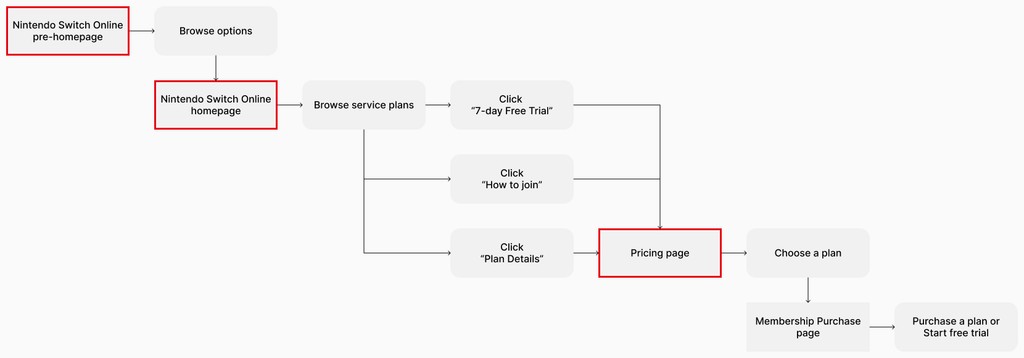
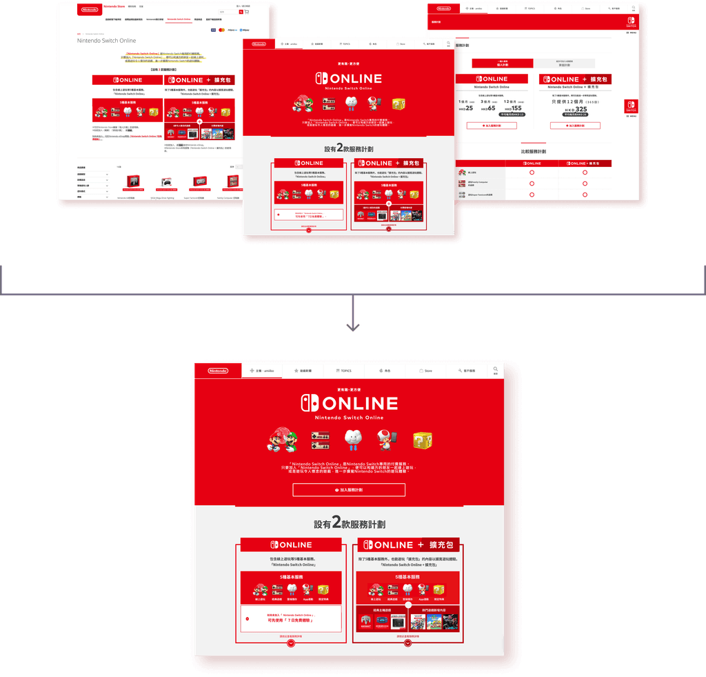
Important information, such as pricing and plan comparisons, are scattered across three pages, requiring users to spend a significant amount of time navigating back and forth to gather the details of the service plans and integrate them on their own. This has increased the interaction cost for users to reach their goals.
Important information, such as pricing and plan comparisons, are scattered across three pages, requiring users to spend a significant amount of time navigating back and forth to gather the details of the service plans and integrate them on their own. This has increased the interaction cost for users to reach their goals.
To address this issue, I consolidated these three pages into a single homepage. Additionally, I added a “支援” (Support) quick-access link in the footer to provide direct assistance to users when needed. This feature can help users complete their tasks independently, even when staff support is not available. At the same time, it prevents overwhelming users by cramming too much information onto a single page.
To address this issue, I consolidated these three pages into a single homepage. Additionally, I added a “支援” (Support) quick-access link in the footer to provide direct assistance to users when needed. This feature can help users complete their tasks independently, even when staff support is not available. At the same time, it prevents overwhelming users by cramming too much information onto a single page.
To address this issue, I consolidated these three pages into a single homepage. Additionally, I added a “支援” (Support) quick-access link in the footer to provide direct assistance to users when needed. This feature can help users complete their tasks independently, even when staff support is not available. At the same time, it prevents overwhelming users by cramming too much information onto a single page.


Focus of Design and
Consistency of Visual Elements
Focus of Design and
Consistency of Visual Elements
Focus of Design and
Consistency of Visual Elements
Since one of the main purposes for the onboarding flow optimization is set to increase the conversion rate of NSO, the design focuses on purchase-related content and elements. A direct Call to Action button is essential to encourage users and guide them toward completing their purchase.
Since one of the main purposes for the onboarding flow optimization is set to increase the conversion rate of NSO, the design focuses on purchase-related content and elements. A direct Call to Action button is essential to encourage users and guide them toward completing their purchase.
Therefore, I combined the “服務計劃詳情” (Plan Details) and “加入方法” (How to Join) buttons into a single “立即加入計劃” (Join Now) button, making it more persuasive and straightforward. Additionally, to help users concentrate on their tasks, I aligned the design of various visual elements, such as title and button sizes, to minimize potential distractions.
Therefore, I combined the “服務計劃詳情” (Plan Details) and “加入方法” (How to Join) buttons into a single “立即加入計劃” (Join Now) button, making it more persuasive and straightforward. Additionally, to help users concentrate on their tasks, I aligned the design of various visual elements, such as title and button sizes, to minimize potential distractions.
Therefore, I combined the “服務計劃詳情” (Plan Details) and “加入方法” (How to Join) buttons into a single “立即加入計劃” (Join Now) button, making it more persuasive and straightforward. Additionally, to help users concentrate on their tasks, I aligned the design of various visual elements, such as title and button sizes, to minimize potential distractions.


TAKEAWAYS
TAKEAWAYS
In approaching this project, I focused on designing elements that align with the existing design system. Rather than developing an entirely new navigation or content layout, I chose to modify the current design to better achieve the project's goals in consideration of practical industry conventions. Throughout this process, I carefully considered the balance between user benefits and brand strategy, making sure the final result works well for both users and the brand.
In approaching this project, I focused on designing elements that align with the existing design system. Rather than developing an entirely new navigation or content layout, I chose to modify the current design to better achieve the project's goals in consideration of practical industry conventions. Throughout this process, I carefully considered the balance between user benefits and brand strategy, making sure the final result works well for both users and the brand.


